
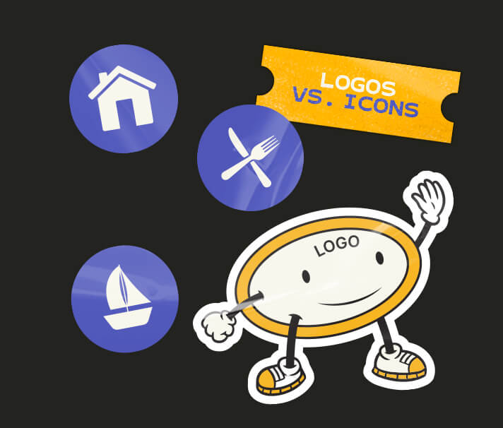
Logos vs icons
August 3, 2026
So what’s the difference between logos and icons? Not usually a common question I hear as usually it’s quite obvious, but visually, the lines seem to definitely be blurring even more these days.
Let’s start with understanding the logo, its different parts, and its main purpose.
What is a logo?
A logo is a simple graphical mark that represents a brand and follows it in all its marketing material.
What does a logo look like?
The logo can appear in many forms. The main different variations of a logo design are:
Wordmark
Unique styled text with no type of imagery, just typography.
Emblem / Avatar
Just an image with no text.
Logo lockup
The more common type of logo with an emblem and wordmark together, usually in landscape or stacked alignment.
When getting a logo designed these days, they’ll often come in a suite of different variations so you have a variety to choose from for whichever occasion (ie, emblem/avatar for social media). You can read more about logo suites in my blog ‘Why one logo isn’t enough anymore’.
What is the purpose of a logo?
The purpose of the logo isn’t to tell the whole story of what the brand does, its purpose is to be remembered and recognised.
Therefore, if needs to be simple, unique and not feel too out of place when sat with its competitors logos.
For example, imagine your industry is a party. All the other guests (the competitors) are wearing smart casual. You wouldn’t want to go looking completely overdressed or you’d feel out of place. You also want to go dressed as smart casual but with the edge that feels right to you and the types of people you want to attract.
What is an icon?
An icon is a small graphical image, that is usually universally recognised to help quickly give information to the viewer quicker than what text might.
What does an icon look like?
Similar to the logo emblem or avatar, the icon is a simple graphic. It does however usually have a recognisable image whereas a logo might be more abstract.
What is the purpose of an icon?
An icons main purpose isn’t to represent a brand like a logo, but more to give information. These are often found in marketing material when a piece of information is given or more commonly, icons are found in signs on the road, at theme parks and even in hospitals.
How the lines are blurring between logos and icons
So now that I’ve mentioned what both logos and icons look like as well as their purposes, you can probably tell the difference between the two.
However, the issue that we’re currently facing, is that logo design itself is slowly blending into what is considered icon design. This was happening long before AI came along.
What’s happening is that some people just aren’t trying with their initial brand setup. Sometimes the name itself might be quite generic and then when it comes to the logo design it’s a case of ‘I’m a baker so I need bread in my logo’.
Unfortunately this mentality doesn’t set you apart from others and that’s when you’re essentially using an icon as a logo design, which can also make you more forgettable.
When you dig deep into a brand and unearth the true story behind it as well as its personality usually portrayed by the owners and staff, that’s when you get to the unique juicy bits that get people falling in love with your brand.
The logo doesn’t need to explain what you do. Leave that to the marketing material and the conversations you have.
Can icons be more than just basic graphics?
100%, yes, absolutely.
I’ve banged on about the negative effects of icons used for logos but the other way around usually isn’t quite as bad, as long as it’s still recognisably understood if it’s being used to show important information.
To really help reinforce a brand identity, iconography can be included as part of the brands visuals. Commonly used icons for that brand with some subtle tweaks to the shape and colour make them part of who they are making them more memorable and professional.
In addition, I am currently seeing a common problem with icons and that is the use of emojis as icons. Emojis were designed for casual chatting and a way of showing emotion, not as a way of displaying information. This approach looks cheap, lazy and can be a bit complicated on the eye. I don’t think you’d ever see an emoji on a road sign.
Summary
Just to summarise, logos are basically a signature for a brand, while icons are used to display quick information or can assist text to identify what the text is about.
If you’d like a logo design, brand design or a suite of iconography that is bespoke to your brand, feel free to get in touch.

Adam Hayles
Freelance Graphic Designer
15+ years in the graphic design world with a desire to provide brands with a fresh upbeat visual personality using design, illustration and animation.
Logos vs icons
August 3, 2026
So what’s the difference between logos and icons? Not usually a common question I hear as usually it’s quite obvious, but visually, the lines seem to definitely be blurring even more these days.
Let’s start with understanding the logo, its different parts, and its main purpose.
What is a logo?
A logo is a simple graphical mark that represents a brand and follows it in all its marketing material.
What does a logo look like?
The logo can appear in many forms. The main different variations of a logo design are:
Wordmark
Unique styled text with no type of imagery, just typography.
Emblem / Avatar
Just an image with no text.
Logo lockup
The more common type of logo with an emblem and wordmark together, usually in landscape or stacked alignment.
When getting a logo designed these days, they’ll often come in a suite of different variations so you have a variety to choose from for whichever occasion (ie, emblem/avatar for social media). You can read more about logo suites in my blog ‘Why one logo isn’t enough anymore’.
What is the purpose of a logo?
The purpose of the logo isn’t to tell the whole story of what the brand does, its purpose is to be remembered and recognised.
Therefore, if needs to be simple, unique and not feel too out of place when sat with its competitors logos.
For example, imagine your industry is a party. All the other guests (the competitors) are wearing smart casual. You wouldn’t want to go looking completely overdressed or you’d feel out of place. You also want to go dressed as smart casual but with the edge that feels right to you and the types of people you want to attract.
What is an icon?
An icon is a small graphical image, that is usually universally recognised to help quickly give information to the viewer quicker than what text might.
What does an icon look like?
Similar to the logo emblem or avatar, the icon is a simple graphic. It does however usually have a recognisable image whereas a logo might be more abstract.
What is the purpose of an icon?
An icons main purpose isn’t to represent a brand like a logo, but more to give information. These are often found in marketing material when a piece of information is given or more commonly, icons are found in signs on the road, at theme parks and even in hospitals.
How the lines are blurring between logos and icons
So now that I’ve mentioned what both logos and icons look like as well as their purposes, you can probably tell the difference between the two.
However, the issue that we’re currently facing, is that logo design itself is slowly blending into what is considered icon design. This was happening long before AI came along.
What’s happening is that some people just aren’t trying with their initial brand setup. Sometimes the name itself might be quite generic and then when it comes to the logo design it’s a case of ‘I’m a baker so I need bread in my logo’.
Unfortunately this mentality doesn’t set you apart from others and that’s when you’re essentially using an icon as a logo design, which can also make you more forgettable.
When you dig deep into a brand and unearth the true story behind it as well as its personality usually portrayed by the owners and staff, that’s when you get to the unique juicy bits that get people falling in love with your brand.
The logo doesn’t need to explain what you do. Leave that to the marketing material and the conversations you have.
Can icons be more than just basic graphics?
100%, yes, absolutely.
I’ve banged on about the negative effects of icons used for logos but the other way around usually isn’t quite as bad, as long as it’s still recognisably understood if it’s being used to show important information.
To really help reinforce a brand identity, iconography can be included as part of the brands visuals. Commonly used icons for that brand with some subtle tweaks to the shape and colour make them part of who they are making them more memorable and professional.
In addition, I am currently seeing a common problem with icons and that is the use of emojis as icons. Emojis were designed for casual chatting and a way of showing emotion, not as a way of displaying information. This approach looks cheap, lazy and can be a bit complicated on the eye. I don’t think you’d ever see an emoji on a road sign.
Summary
Just to summarise, logos are basically a signature for a brand, while icons are used to display quick information or can assist text to identify what the text is about.
If you’d like a logo design, brand design or a suite of iconography that is bespoke to your brand, feel free to get in touch.
Adam Hayles
Freelance Graphic Designer
15+ years in the graphic design world with a desire to provide brands with a fresh upbeat visual personality using design, illustration and animation.


Logos vs icons
August 3, 2026
So what’s the difference between logos and icons? Not usually a common question I hear as usually it’s quite obvious, but visually, the lines seem to definitely be blurring even more these days.
Let’s start with understanding the logo, its different parts, and its main purpose.
What is a logo?
A logo is a simple graphical mark that represents a brand and follows it in all its marketing material.
What does a logo look like?
The logo can appear in many forms. The main different variations of a logo design are:
Wordmark
Unique styled text with no type of imagery, just typography.
Emblem / Avatar
Just an image with no text.
Logo lockup
The more common type of logo with an emblem and wordmark together, usually in landscape or stacked alignment.
When getting a logo designed these days, they’ll often come in a suite of different variations so you have a variety to choose from for whichever occasion (ie, emblem/avatar for social media). You can read more about logo suites in my blog ‘Why one logo isn’t enough anymore’.
What is the purpose of a logo?
The purpose of the logo isn’t to tell the whole story of what the brand does, its purpose is to be remembered and recognised.
Therefore, if needs to be simple, unique and not feel too out of place when sat with its competitors logos.
For example, imagine your industry is a party. All the other guests (the competitors) are wearing smart casual. You wouldn’t want to go looking completely overdressed or you’d feel out of place. You also want to go dressed as smart casual but with the edge that feels right to you and the types of people you want to attract.
What is an icon?
An icon is a small graphical image, that is usually universally recognised to help quickly give information to the viewer quicker than what text might.
What does an icon look like?
Similar to the logo emblem or avatar, the icon is a simple graphic. It does however usually have a recognisable image whereas a logo might be more abstract.
What is the purpose of an icon?
An icons main purpose isn’t to represent a brand like a logo, but more to give information. These are often found in marketing material when a piece of information is given or more commonly, icons are found in signs on the road, at theme parks and even in hospitals.
How the lines are blurring between logos and icons
So now that I’ve mentioned what both logos and icons look like as well as their purposes, you can probably tell the difference between the two.
However, the issue that we’re currently facing, is that logo design itself is slowly blending into what is considered icon design. This was happening long before AI came along.
What’s happening is that some people just aren’t trying with their initial brand setup. Sometimes the name itself might be quite generic and then when it comes to the logo design it’s a case of ‘I’m a baker so I need bread in my logo’.
Unfortunately this mentality doesn’t set you apart from others and that’s when you’re essentially using an icon as a logo design, which can also make you more forgettable.
When you dig deep into a brand and unearth the true story behind it as well as its personality usually portrayed by the owners and staff, that’s when you get to the unique juicy bits that get people falling in love with your brand.
The logo doesn’t need to explain what you do. Leave that to the marketing material and the conversations you have.
Can icons be more than just basic graphics?
100%, yes, absolutely.
I’ve banged on about the negative effects of icons used for logos but the other way around usually isn’t quite as bad, as long as it’s still recognisably understood if it’s being used to show important information.
To really help reinforce a brand identity, iconography can be included as part of the brands visuals. Commonly used icons for that brand with some subtle tweaks to the shape and colour make them part of who they are making them more memorable and professional.
In addition, I am currently seeing a common problem with icons and that is the use of emojis as icons. Emojis were designed for casual chatting and a way of showing emotion, not as a way of displaying information. This approach looks cheap, lazy and can be a bit complicated on the eye. I don’t think you’d ever see an emoji on a road sign.
Summary
Just to summarise, logos are basically a signature for a brand, while icons are used to display quick information or can assist text to identify what the text is about.
If you’d like a logo design, brand design or a suite of iconography that is bespoke to your brand, feel free to get in touch.
Adam Hayles
Freelance Graphic Designer
15+ years in the graphic design world with a desire to provide brands with a fresh upbeat visual personality using design, illustration and animation.