
Brand identity for new flavour of IPA
New flavour and opportunity to attract a broader demographic
Some background into the brewery
Ok, so just like Loco Choco, this is not a real company either…sorry. However, I used an AI chatbot to act as the client, leaving me to ask all those important questions in the discovery phase.
Tom Walker, the name the bot gave itself, has owned a microbrewery for 12 years in what was once a busy steelworks in Nottingham.
His company, North Forge Brewing Co., already had a range of several beers, all with quirky names relating to blacksmith terminology, such as ‘Black Anvil Stout’ and ‘Hammerstone Lager’.
With the industrial theme running through the veins of the brand, the brewery mostly attracted working men aged 35-60 from the local and surrounding areas.
A new drink for a wider audience
Tom’s mission was to expand the brewery’s customer base by reaching to a wider, more broad audience. He wanted to attract younger customers of all genders.
To do this, the brewery would launch a tropical IPA; a drink that was currently trending with younger beer fans. This new beer would sit nicely with the existing range of brews and not be too disjointed from the overseeing brewery brand and its current clientele.
To really tap into this extended audience and be noticeable on busy shelves, these visuals needed to be damn striking. In addition, the bot…sorry, Tom…also called upon me to come up with a name for the new beverage. A name that not just needed to tell a story, but also needed to sit well in the North Forge family of drinks.
What the brand needed to portray
The new IPA recipe was a lot more punchier than most other tropical IPAs on the market. This meant that the brand needed to promote an explosion of citrus flavour but without using images of fruit - due to the flavours coming solely from the hops.
It also needed to portray fun, excitement and summer beach vibes, while somehow including reference to the steelworks roots.
My suggestions for the direction
Thinking down the route of the current ‘workers’ theme, this drink did feel like it would be a bit different as it was delving into new audiences. With that in mind, what is totally different from ‘working’ or ‘jobs’?…that’s right…vacation!
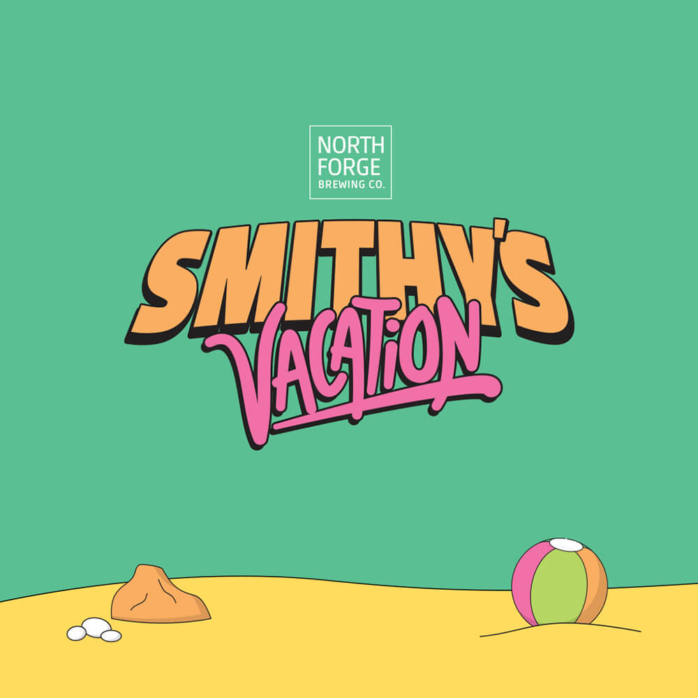
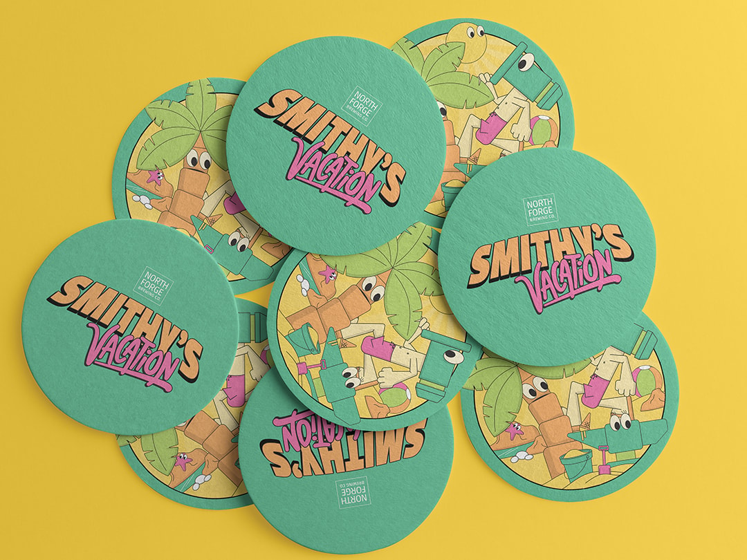
Smithy’s Vacation felt like a name that would portray this IPA in the way that was intended. Blacksmith’s on holiday. The drink for the weekend. The brew for the beach parties.
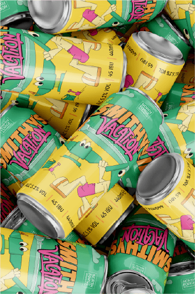
And to really engage with the younger demographic, I put across the idea of using bright colours and illustrated characters in the form of abstract blacksmith tools, with the intent of there being a main character who people would assume would be ‘Smithy’.
Approaching the brand design
First things first, we needed a mood board. Before creating any assets, I gathered relevant imagery from other sources that portrayed bright colours and illustration styles, to help set the vibe for three directions.

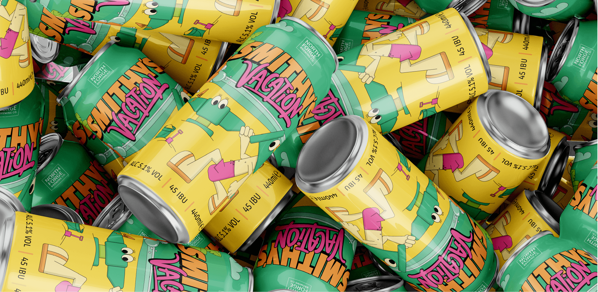
With one of the directions approved, I then looked at sketching the characters and other illustrated assets. In most cases, the logo design might come first, but the main marketing asset of this new drink would be the can itself, and in my mind the logo would almost be integrated within this, so it only felt right to work on the items at the same time.
Once illustrations and rough logo designs were sketched out, it was time to digitise them in Adobe Illustrator. With the moodboard at hand, I also looked carefully into colour choices, making sure to choose vibrant colours that could work well together and be legible.
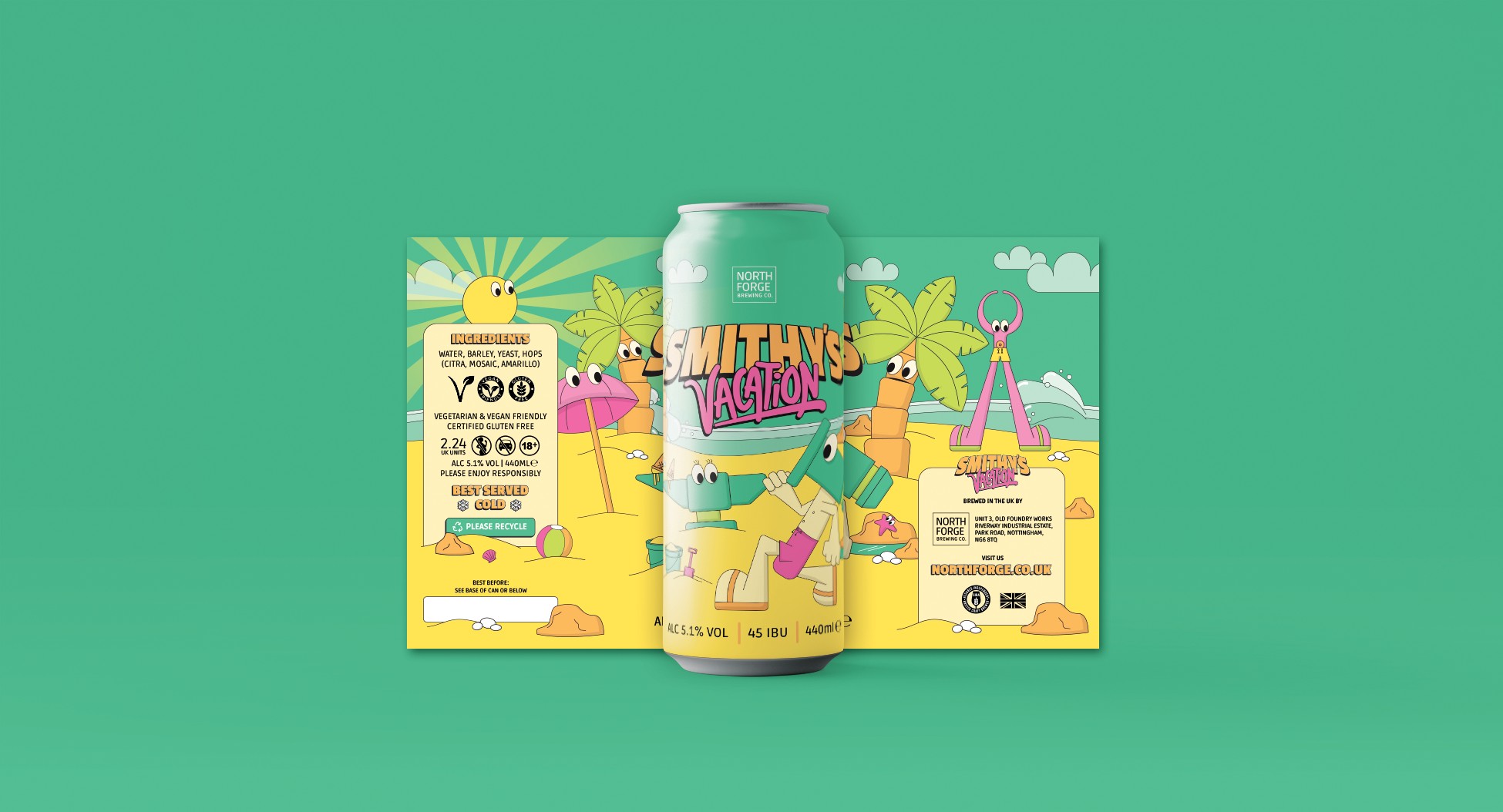
Once I had all the assets, I was able to place them onto the can design leaving room for ingredients and the important info, at a decent readable size.
What else was needed for this drink
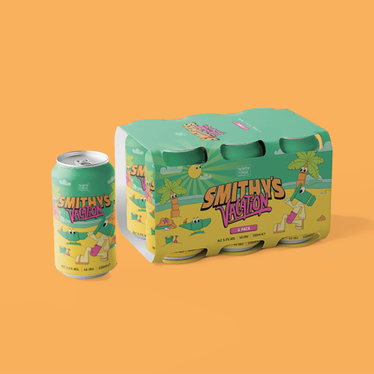
As well as the can itself, boxes for multipacks also needed to be thought about. They equally needed to be striking and to be consistent with the single can design.
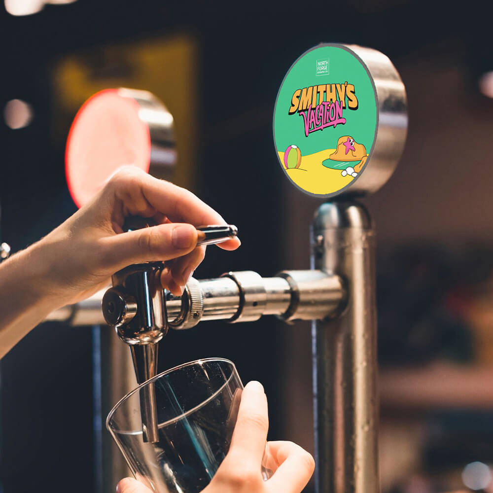
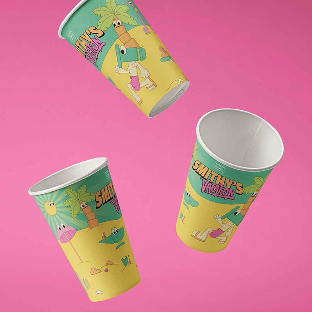
In addition, I needed to create beer mats and pump clips for the taproom, as well as launch party graphics, disposable cups and examples of how interior design graphics might look.
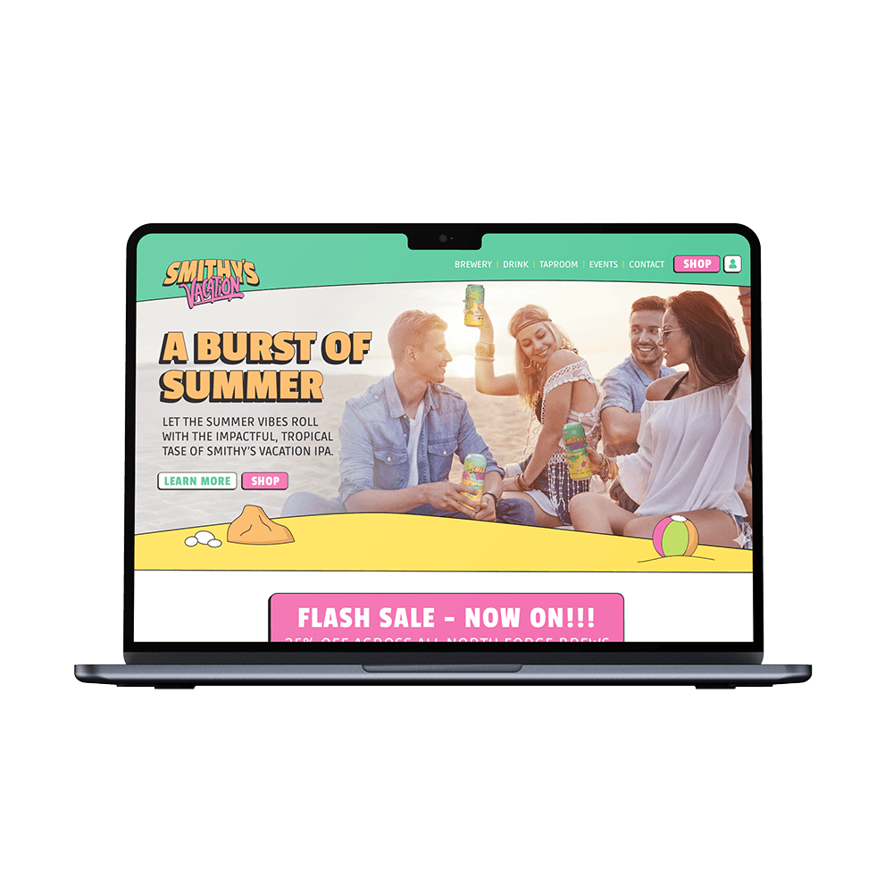
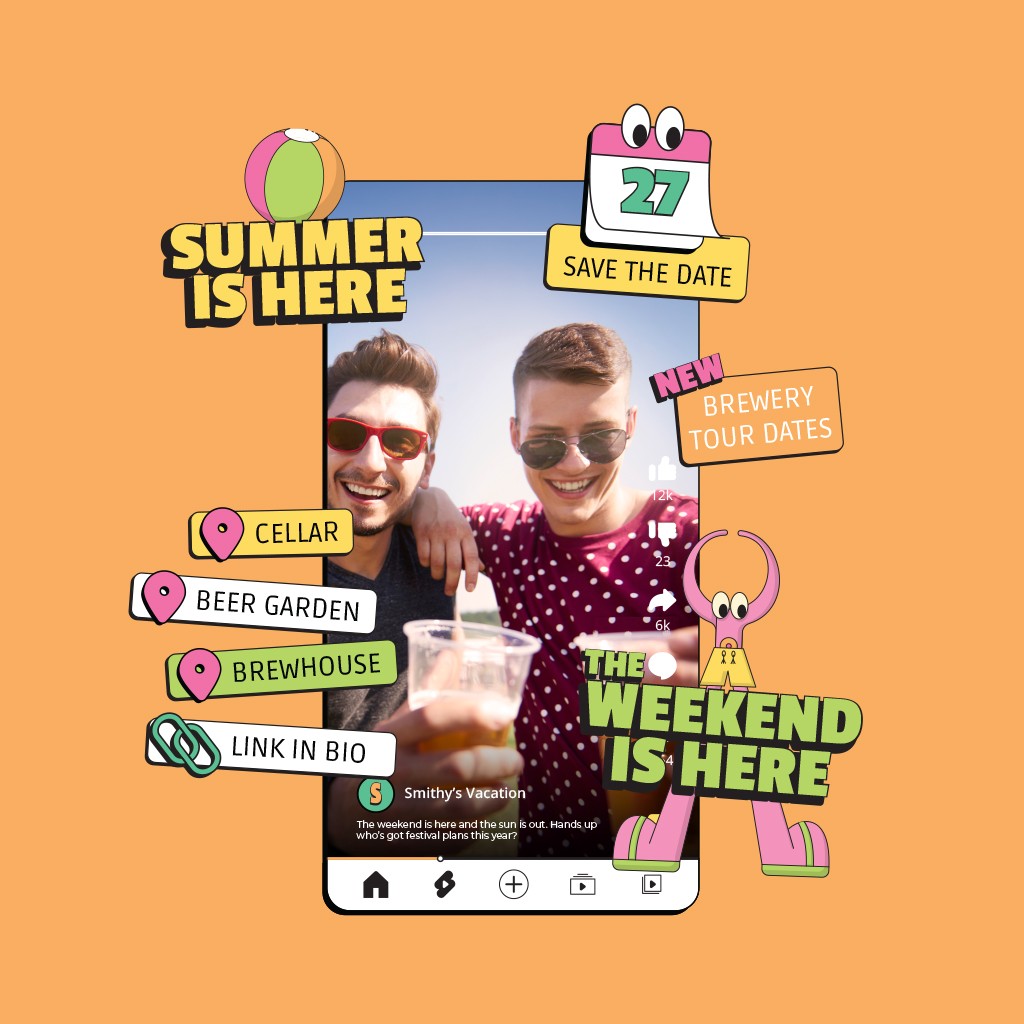
The idea of this IPA was to reach and sell to as many people as possible, through an e/commerce website and social media marketing. For this, I created range of various UI graphics to help give direction for the brand online presence. Animated GIF stickers were also needed for social media reels for the team to later post themselves in apps like Canva.
In addition to the social media posting assets, items such as cover photos, profile pictures and even graphics for the craft beer app, Untappd, were all needed.
The final outcome
I’m sure if I uploaded these designs to AI Tom he’d be able to leave me with a cracking testimonial, but that would be a load of BS.
However, a variety of social media posts of these design went out on my Instagram and the feedback was pretty darn good. Why not check it out?
Brand identity for new flavour of IPA
New flavour and opportunity to attract a broader demographic
Some background into the brewery
Ok, so just like Loco Choco, this is not a real company either…sorry. However, I used an AI chatbot to act as the client, leaving me to ask all those important questions in the discovery phase.
Tom Walker, the name the bot gave itself, has owned a microbrewery for 12 years in what was once a busy steelworks in Nottingham.
His company, North Forge Brewing Co., already had a range of several beers, all with quirky names relating to blacksmith terminology, such as ‘Black Anvil Stout’ and ‘Hammerstone Lager’.
With the industrial theme running through the veins of the brand, the brewery mostly attracted working men aged 35-60 from the local and surrounding areas.
A new drink for a wider audience
Tom’s mission was to expand the brewery’s customer base by reaching to a wider, more broad audience. He wanted to attract younger customers of all genders.
To do this, the brewery would launch a tropical IPA; a drink that was currently trending with younger beer fans. This new beer would sit nicely with the existing range of brews and not be too disjointed from the overseeing brewery brand and its current clientele.
To really tap into this extended audience and be noticeable on busy shelves, these visuals needed to be damn striking. In addition, the bot…sorry, Tom…also called upon me to come up with a name for the new beverage. A name that not just needed to tell a story, but also needed to sit well in the North Forge family of drinks.
What the brand needed to portray
The new IPA recipe was a lot more punchier than most other tropical IPAs on the market. This meant that the brand needed to promote an explosion of citrus flavour but without using images of fruit - due to the flavours coming solely from the hops.
It also needed to portray fun, excitement and summer beach vibes, while somehow including reference to the steelworks roots.
My suggestions for the direction
Thinking down the route of the current ‘workers’ theme, this drink did feel like it would be a bit different as it was delving into new audiences. With that in mind, what is totally different from ‘working’ or ‘jobs’?…that’s right…vacation!
Smithy’s Vacation felt like a name that would portray this IPA in the way that was intended. Blacksmith’s on holiday. The drink for the weekend. The brew for the beach parties.
And to really engage with the younger demographic, I put across the idea of using bright colours and illustrated characters in the form of abstract blacksmith tools, with the intent of there being a main character who people would assume would be ‘Smithy’.
Approaching the brand design
First things first, we needed a mood board. Before creating any assets, I gathered relevant imagery from other sources that portrayed bright colours and illustration styles, to help set the vibe for three directions.
With one of the directions approved, I then looked at sketching the characters and other illustrated assets. In most cases, the logo design might come first, but the main marketing asset of this new drink would be the can itself, and in my mind the logo would almost be integrated within this, so it only felt right to work on the items at the same time.
Once illustrations and rough logo designs were sketched out, it was time to digitise them in Adobe Illustrator. With the moodboard at hand, I also looked carefully into colour choices, making sure to choose vibrant colours that could work well together and be legible.
Once I had all the assets, I was able to place them onto the can design leaving room for ingredients and the important info, at a decent readable size.
What else was needed for this drink
As well as the can itself, boxes for multipacks also needed to be thought about. They equally needed to be striking and to be consistent with the single can design.
In addition, I needed to create beer mats and pump clips for the taproom, as well as launch party graphics, disposable cups and examples of how interior design graphics might look.
The idea of this IPA was to reach and sell to as many people as possible, through an e/commerce website and social media marketing. For this, I created range of various UI graphics to help give direction for the brand online presence. Animated GIF stickers were also needed for social media reels for the team to later post themselves in apps like Canva.
In addition to the social media posting assets, items such as cover photos, profile pictures and even graphics for the craft beer app, Untappd, were all needed.
The final outcome
I’m sure if I uploaded these designs to AI Tom he’d be able to leave me with a cracking testimonial, but that would be a load of BS.
However, a variety of social media posts of these design went out on my Instagram and the feedback was pretty darn good. Why not check it out?