
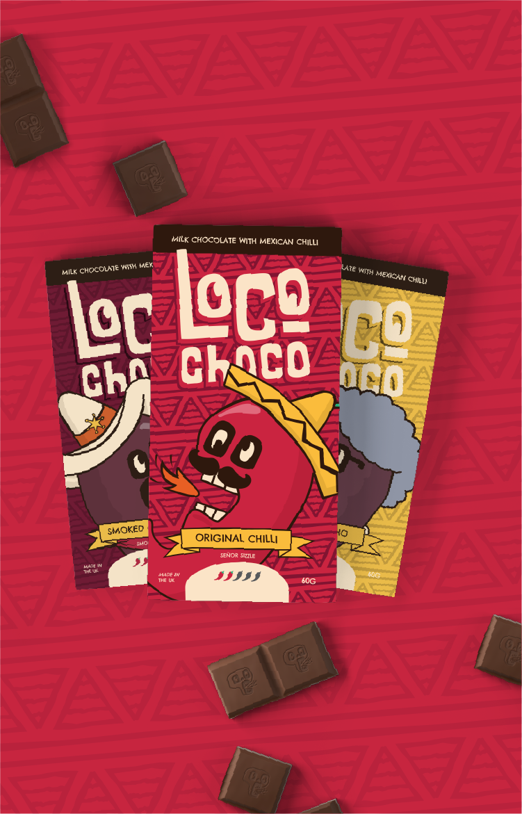
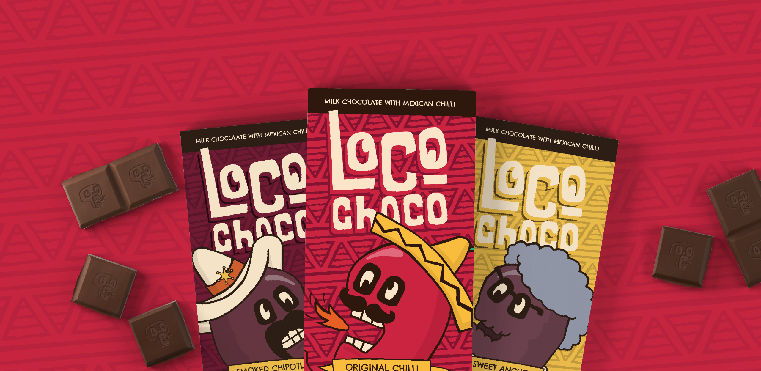
Illustrated mascot design for chilli chocolate company
A series of illustrated characters tailored to the range of flavours
A lil’ bit of background
Ok, so this client is a little different from most clients, in the sense that they’re not real. In fact, I asked ChatGPT if it could role play itself as a client starting up a chilli chocolate brand wanting a visual identity. The rest was down to me to ask the right questions to get the best outcome to solve their (it’s) problem.
The bot took on the form of ex-head chef and foodie John, who was partnering up with his son, Rob, to create a chilli chocolate brand that went against the grain. It would target an ever growing younger generation of foodies looking for new and exciting cultural experiences.
John and Rob had experimented with different recipes which mainly consisted of Mexican ingredients. They’d settled on three core flavours to get them going, with one of them being a more standard, original flavour.
The brief was brief
‘Take this new and exciting product we’ve created for this younger audience, and give it its own identity that spices up the industry’. That was basically the brief.
As for deliverables, they were after everything from name to logo design, as well as a direction and execution for the package design, along with brand guidelines for consistency in their marketing materials that would follow.
How I approachedthis sweet brief
During the discovery phase, I asked many questions about the business, their main competitors, their purpose, values and what personality they saw the brand having, as well as the vision they had and the potential for new flavours and expansion.
I also asked about their backstories to help get an understanding of the people behind the chilli chocolate. John and Rob both liked to travel and and try new and exotic foods.
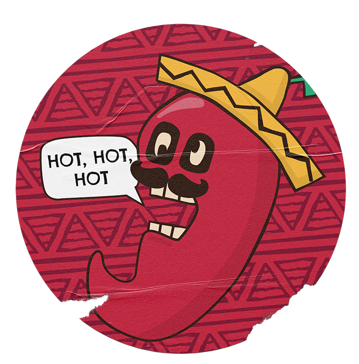
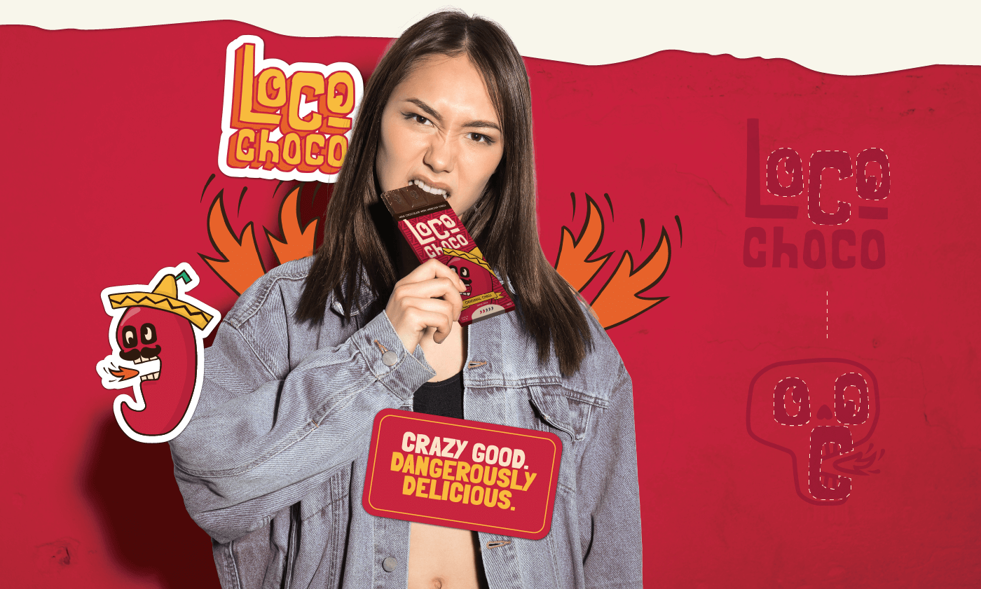
After understanding about how they wanted to position themselves against competitors that were mainly aimed at an older generation and also came across quite luxurious, my suggestion was that this brand oozed personality. To do that, I suggested mascot design, not just for the logo design, but for each flavour as well, giving each recipe its own big identity.
This direction would give the brand life, sit well with its younger audience and would give them potential for easy merchandising if they ever wanted, down the line.
Those pesky challenges that lay ahead
The main obstacles on the horizon after the direction was agreed, was to create a series of package designs that not only felt part of the same family, but also be different in their own way.
With talks of other flavours to be added down the line, with some being limited editions and others released as a group, these ideas had to be carefully considered to make any future growth plans that bit more easier to integrate as new families but also different…kinda like cousins, etc.
The big ol’ process
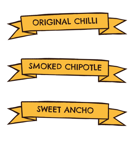
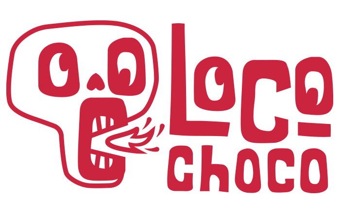
After I got all the correct information that was needed, I needed to think of a brand name, flavour names and potentially character names, to really make the world that sits this brand that bit more enjoyable. After some careful thought and discussion, we settled on the name ‘Loco Choco’. This played into the Mexican culture with ‘loco’ meaning ‘crazy’ in Spanish. And ‘choco’ speaks for itself.
Then it was time to create three moodboards for a choice of directions. With illustrated characters being agreed from the beginning, the moodboards would look at different illustrated character styles, as well as colours, fonts, photography and overall vibe, while leaning into the crazy element.
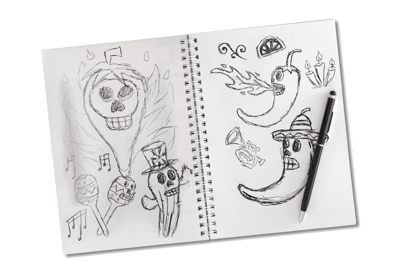
After a direction was agreed on, this set the tone for all things going forward. Sketches were made for the logo design and main original flavour character design, with drawings that I felt were stronger being polished off digitally, having colours applied and put into a presentation PDF to show how it would sit in the real world. Tweaks were made here and there until this phase was signed off.
Next, the path was set for the package design, as well as the remaining characters, supporting fonts, patterns and any other pieces that were needed along the way.
Done and dusted
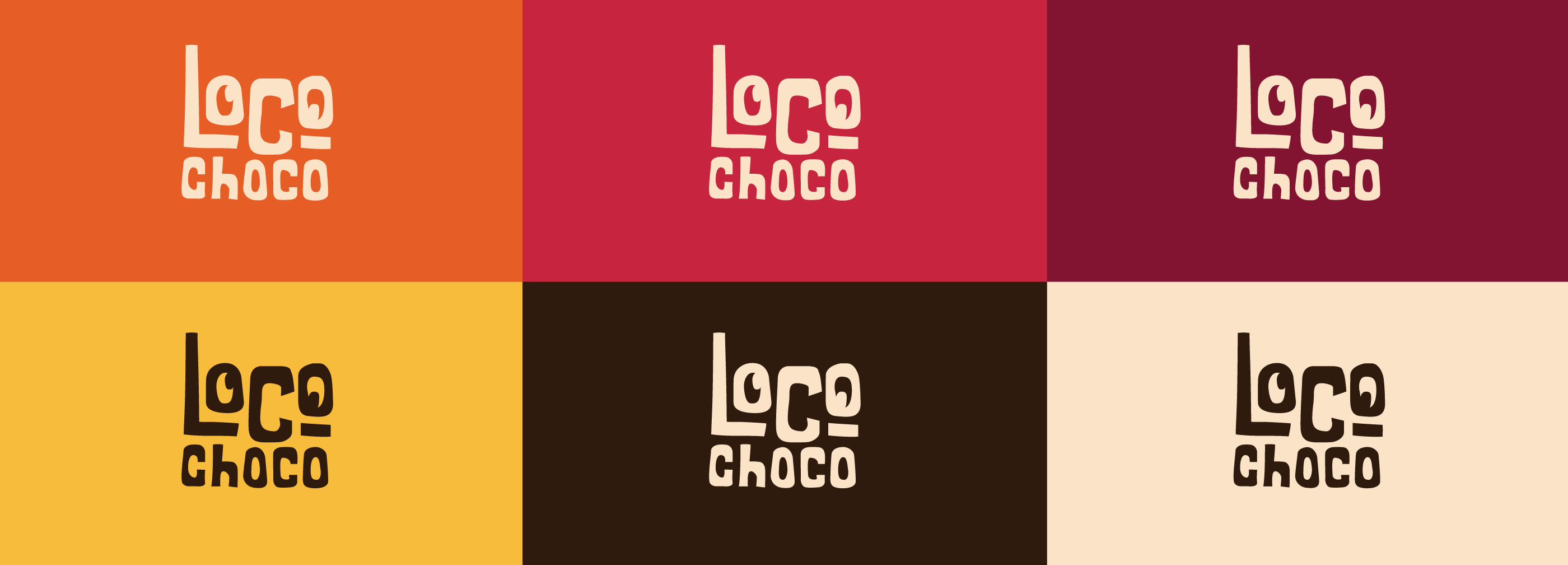
The final outcome consisted of a folder containing a logo suite for all variations of logos…shameless plug, but see my blog on logo suites here.
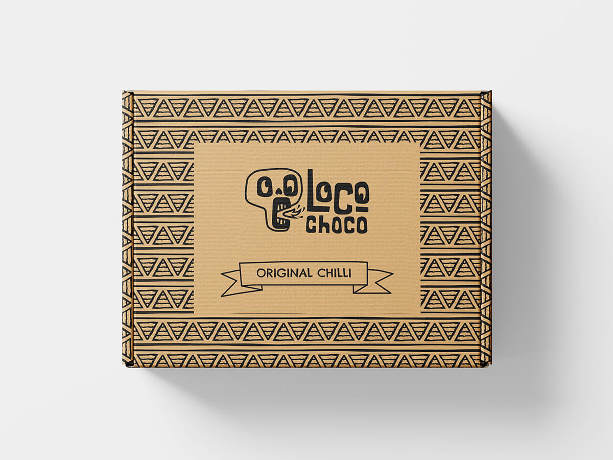
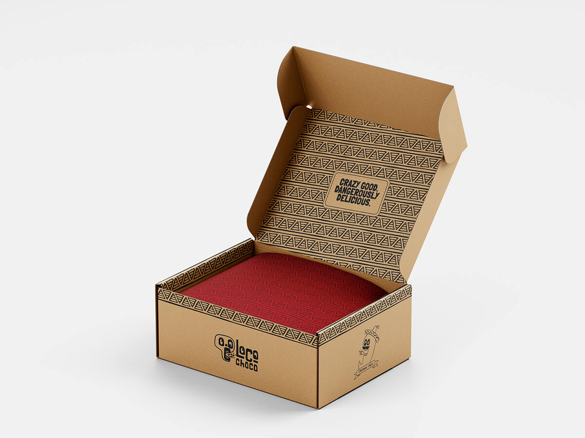
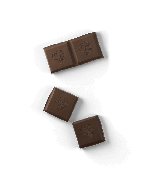
Also included was three fully completed package designs, ready for print with bleeds and what not…shameless plug number 2, here’s my blog about print bleeds.
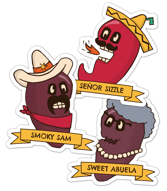
Separated character designs, illustrations and pattern files were also included for use on social media and other marketing materials.
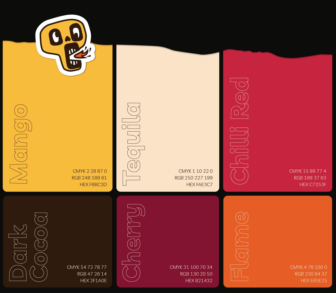
In addition there was a single page style guide for quick vibe matching which included colour codes, fonts used and photography and illustration styles.
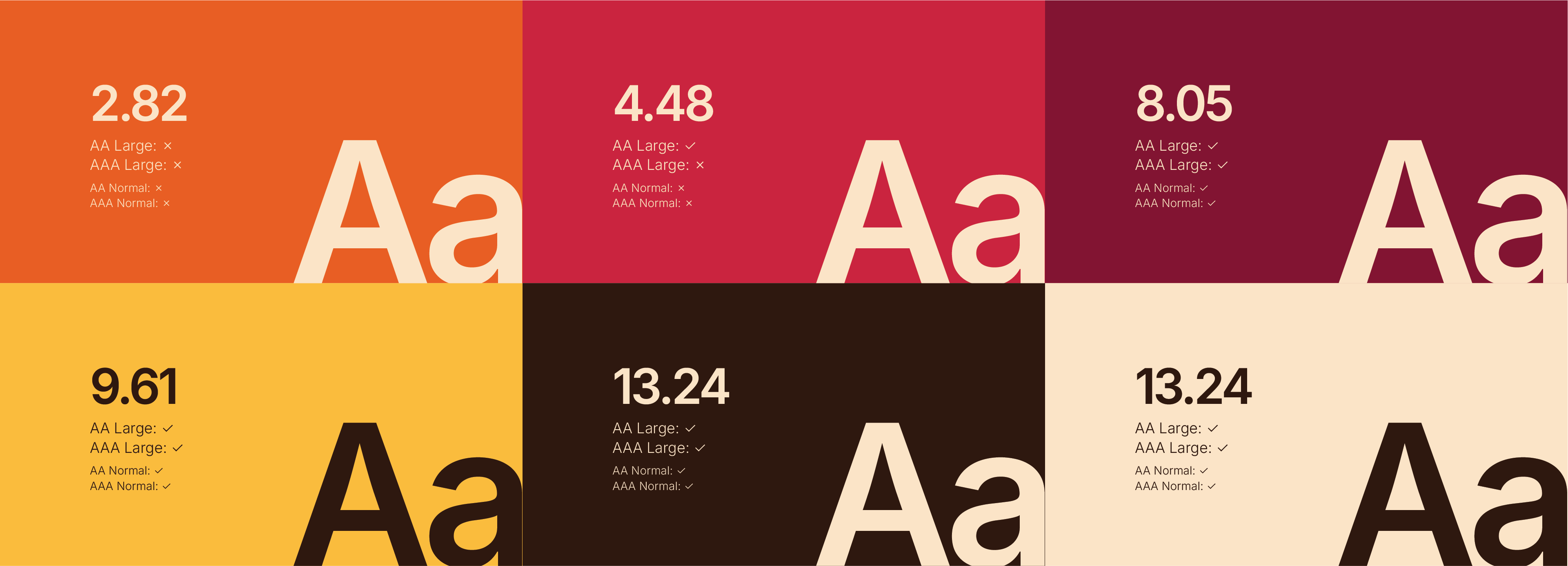
There was also a full blown brand guidelines complete with all the juicy stuff such as, purpose, mission, vision, values, logo, fonts, tone, colour contrast ratings for accessibility and various other bits and bobs.
Illustrated mascot design for chilli chocolate company
A series of illustrated characters tailored to the range of flavours
A lil’ bit of background
Ok, so this client is a little different from most clients, in the sense that they’re not real. In fact, I asked ChatGPT if it could role play itself as a client starting up a chilli chocolate brand wanting a visual identity. The rest was down to me to ask the right questions to get the best outcome to solve their (it’s) problem.
The bot took on the form of ex-head chef and foodie John, who was partnering up with his son, Rob, to create a chilli chocolate brand that went against the grain. It would target an ever growing younger generation of foodies looking for new and exciting cultural experiences.
John and Rob had experimented with different recipes which mainly consisted of Mexican ingredients. They’d settled on three core flavours to get them going, with one of them being a more standard, original flavour.
The brief was brief
‘Take this new and exciting product we’ve created for this younger audience, and give it its own identity that spices up the industry’. That was basically the brief.
As for deliverables, they were after everything from name to logo design, as well as a direction and execution for the package design, along with brand guidelines for consistency in their marketing materials that would follow.
How I approachedthis sweet brief
During the discovery phase, I asked many questions about the business, their main competitors, their purpose, values and what personality they saw the brand having, as well as the vision they had and the potential for new flavours and expansion.
I also asked about their backstories to help get an understanding of the people behind the chilli chocolate. John and Rob both liked to travel and and try new and exotic foods.
After understanding about how they wanted to position themselves against competitors that were mainly aimed at an older generation and also came across quite luxurious, my suggestion was that this brand oozed personality. To do that, I suggested mascot design, not just for the logo design, but for each flavour as well, giving each recipe its own big identity.
This direction would give the brand life, sit well with its younger audience and would give them potential for easy merchandising if they ever wanted, down the line.
Those pesky challenges that lay ahead
The main obstacles on the horizon after the direction was agreed, was to create a series of package designs that not only felt part of the same family, but also be different in their own way.
With talks of other flavours to be added down the line, with some being limited editions and others released as a group, these ideas had to be carefully considered to make any future growth plans that bit more easier to integrate as new families but also different…kinda like cousins, etc.
The big ol’ process
After I got all the correct information that was needed, I needed to think of a brand name, flavour names and potentially character names, to really make the world that sits this brand that bit more enjoyable. After some careful thought and discussion, we settled on the name ‘Loco Choco’. This played into the Mexican culture with ‘loco’ meaning ‘crazy’ in Spanish. And ‘choco’ speaks for itself.
Then it was time to create three moodboards for a choice of directions. With illustrated characters being agreed from the beginning, the moodboards would look at different illustrated character styles, as well as colours, fonts, photography and overall vibe, while leaning into the crazy element.
After a direction was agreed on, this set the tone for all things going forward. Sketches were made for the logo design and main original flavour character design, with drawings that I felt were stronger being polished off digitally, having colours applied and put into a presentation PDF to show how it would sit in the real world. Tweaks were made here and there until this phase was signed off.
Next, the path was set for the package design, as well as the remaining characters, supporting fonts, patterns and any other pieces that were needed along the way.
Done and dusted
The final outcome consisted of a folder containing a logo suite for all variations of logos…shameless plug, but see my blog on logo suites here.
Also included was three fully completed package designs, ready for print with bleeds and what not…shameless plug number 2, here’s my blog about print bleeds.
Separated character designs, illustrations and pattern files were also included for use on social media and other marketing materials.
In addition there was a single page style guide for quick vibe matching which included colour codes, fonts used and photography and illustration styles.
There was also a full blown brand guidelines complete with all the juicy stuff such as, purpose, mission, vision, values, logo, fonts, tone, colour contrast ratings for accessibility and various other bits and bobs.