
Logo design and visual direction for craft company
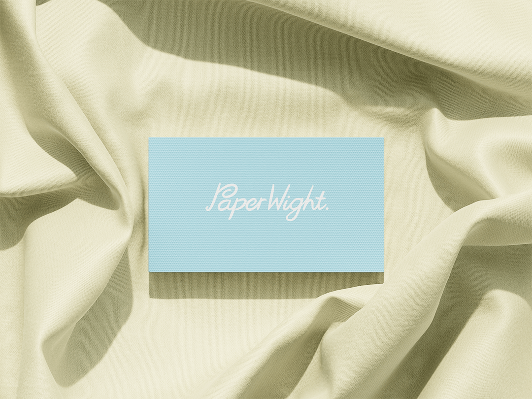
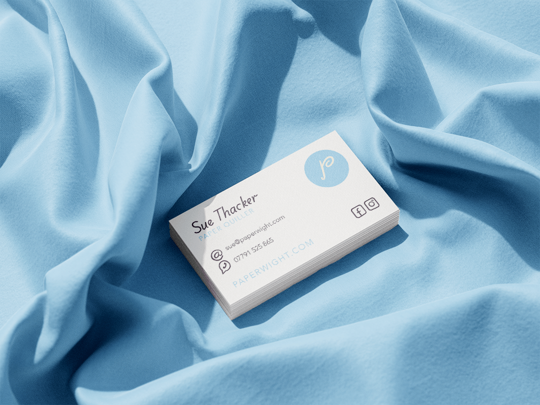
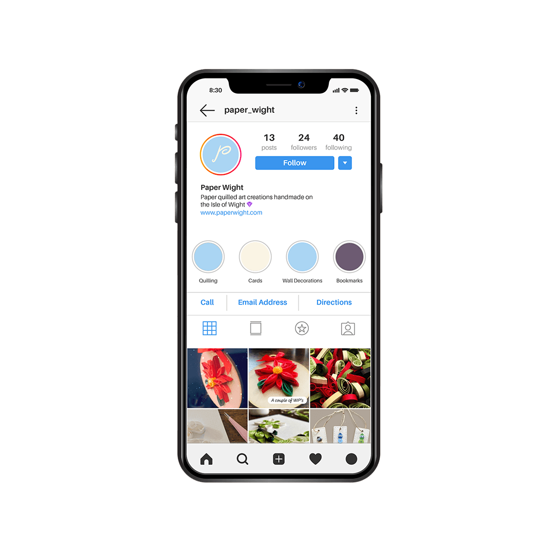
Logo, business cards and everything needed down the line
The outline of this branding project
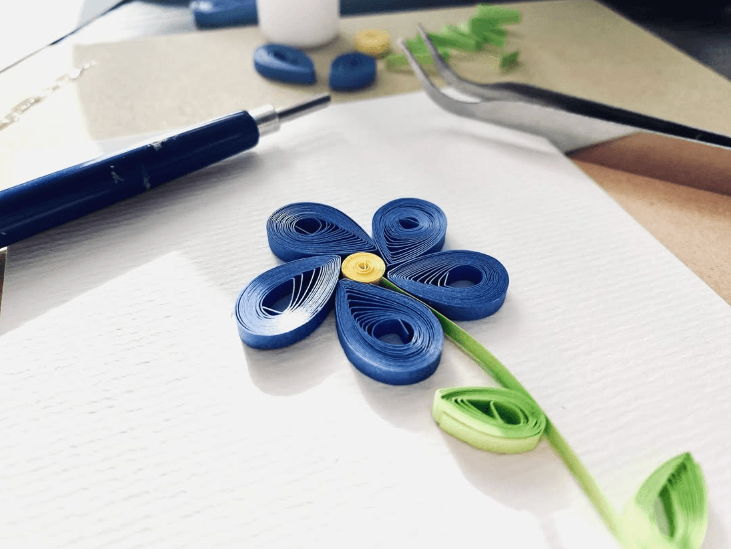
Being the loving son that I am, this little brand design project was a gift to my mum to help give the direction she needed for her brand new side hustle business of making and selling hand crafted cards, made from a technique called ‘paper quilling’.
The goal was to create visual clarity that could used on packaging, event signage, handouts and social media.
A quick catchup meeting
Prior to our catchup meeting, I’d been told a bit about the project and ideas for it. This helped with creative thinking before we could have a proper chat about it.
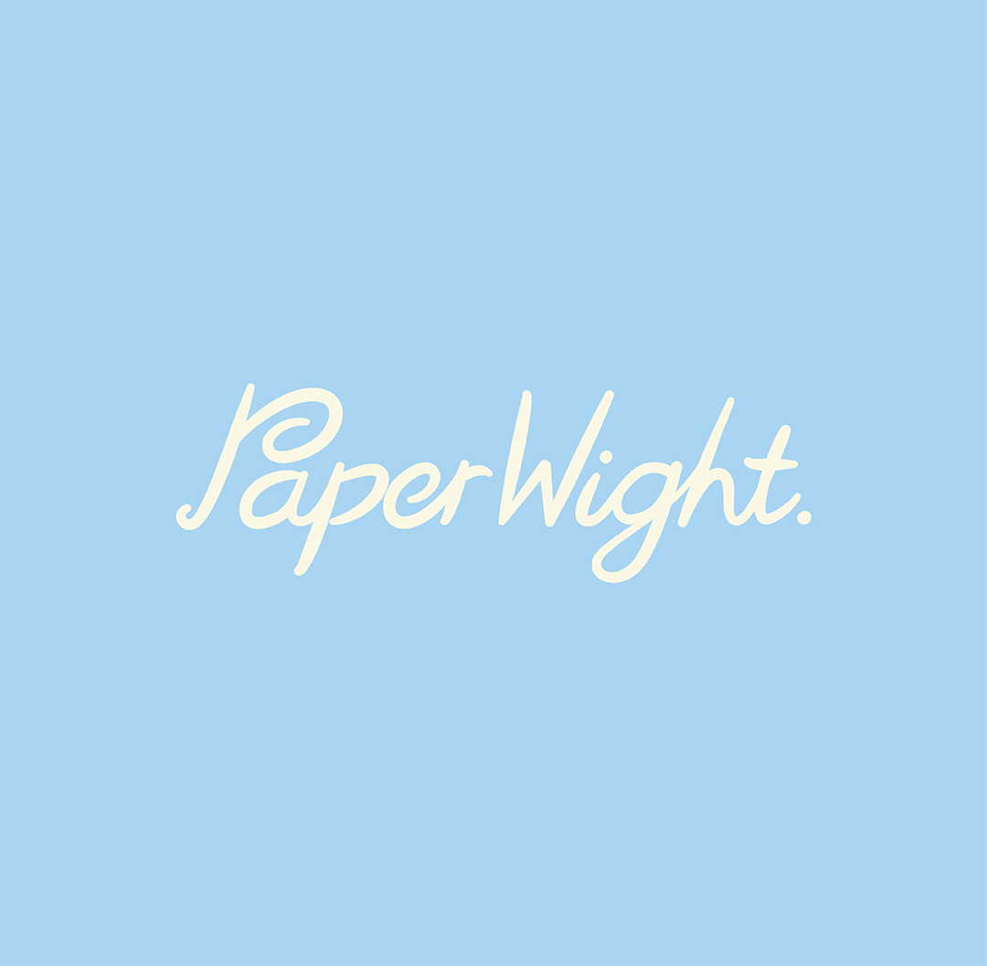
She mentioned about her vision along with her chosen name ‘Paper Wight’. It was a play on words to sound like ‘paperweight’, while using elements of the Isle of Wight and the paper quilling process involved. She also had an idea to use the shape of the Isle of Wight as the logo as well.
During our chat, I was able to steer her away from the logo design, but she had her heart set on the name so there was no budging there. The reason for me doing this? Well, on our island there’s so many Isle of Wight shaped logos and so many companies using the name ‘Wight’ or other variations. My approach is to be creative right from the start. Nothing too obvious if you want to be remembered.
If you’re starting your own brand and want some understanding on identifying its personality from the start, download my free workbook here.
So my suggestion on the logo itself, was to play into the curls and spiral effects that paper quilling gives. With social media in mind, my focus was on creating something iconic that could be used for the avatar. That could’ve been a separate logo mark detachable from the text, but in this case I went for the approach of using the first letter and making it unique.
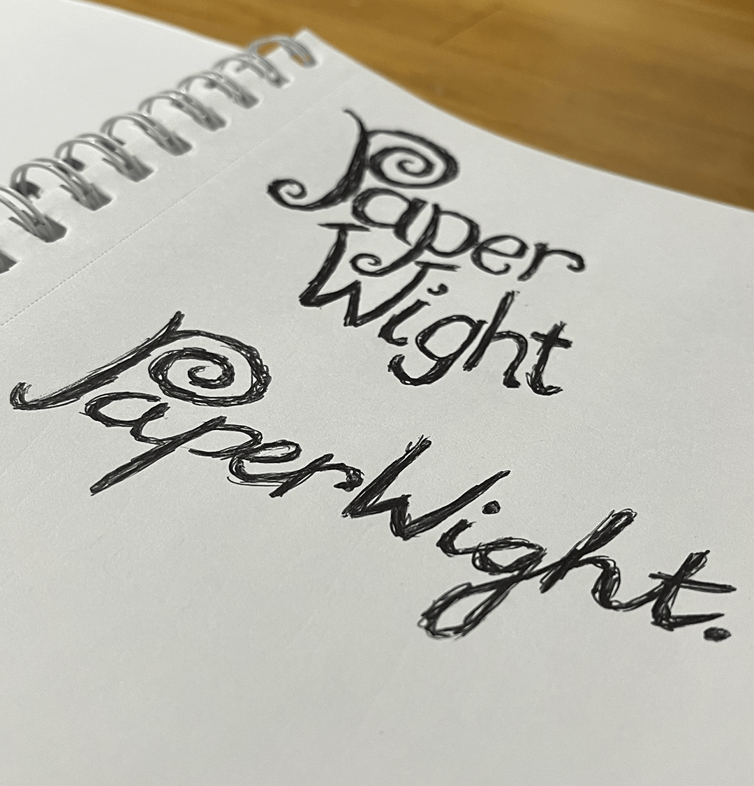
With that in mind, I sketched the idea onto one of the pub’s activity sheets for kids with a wax crayon, and once I explained it, it got the approval.
The designing process
Usually after a discovery meeting I’d put together three mood board directions for the client to choose from. In this case, I wanted to keep hours firm on a gift, plus I actually felt pretty confident on the direction I had in mind for this direction.
That all being said, I wanted to make sure that I wasn’t going into this two footed, so I researched some competitors. Big greeting card chains along with local suppliers. The majority used wordmark style logos, with a handful leaning into a more scripted font, so this worked well for my concept.
I took the crayon sketch to the next level. First it was more sketches to finalise overall style, and then it was created the vector graphic in Adobe Illustrator.
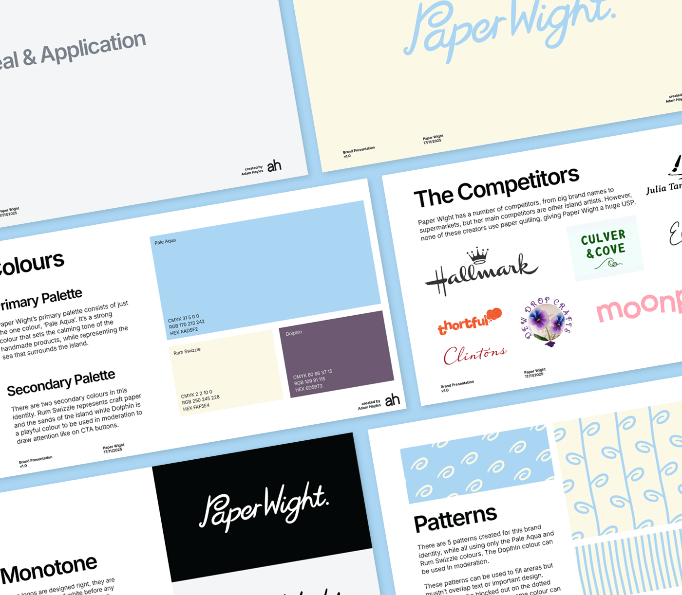
Once the logo was done, it was to explore colours. My mum explained how she liked blue and yellow to represent the sand and sea of the island. I felt that a more pastel direction on these colours might be more beneficial to her audience and to her own personality and nature of the business.
Once a few other bits were ironed out it was time to put it all together into a presentation.
The presentation
I caught up with my mum again to present her with the 24 page document…which to be fair, was probably overkill in page count.
It went through her purpose, mission, vision and values as well as competitors. This information wasn’t provided, but knowing my mum and digging around online, I was able to present these.
Then it came to the logo reveal, and in response I got the phrase ‘is that it?’
Luckily, I had a few more pages to go through which showed the logo in use, how it would sit alongside competitors as well as the rationale behind it. Then it all made sense to her. ‘A logo doesn’t sell what I do. It’s a symbol for others to recognise’.
So many people go wrong with logos either by including everything they do within it and making it look overcomplicated, or they go for too obvious so that they’re not remembered.
The sign-off
After presenting this document, I told my mum to sit on it for a week or two, print it out and stick it all around the house. She came back with an instant approval, no amends, only two days later *slaps palm into face*. The reason behind leaving it for awhile before fully committing, is so that you can get used to it. You have to live with this logo for a bloody long time so if you hate it by next week, then it’s going to be difficult to rebrand so soon after launching.
Once the sign-off came through and I’d given it a bit of time, the logos were exported in all their formats (read here to learn more on logo suites). I also exported the pattern designs from the logo presentation.
In addition, I made sure that she had a copy of the presentation itself. This had things like colour codes on it and gave her that extra bit of visual direction that she could look back on.


Adam recently designed and created a logo for my new small business which really suits the brief to a tee! He’s also designed some clever variations of branding and a really good video that I could post on my social media to make my brand more appealing. Because of this, I’ve just received my first bulk order! Would 100% recommend Adam for all your graphic design needs.
Sue Thacker, Paper Wight
Logo design and visual direction for craft company
Logo, business cards and everything needed down the line
The outline of this branding project
Being the loving son that I am, this little brand design project was a gift to my mum to help give the direction she needed for her brand new side hustle business of making and selling hand crafted cards, made from a technique called ‘paper quilling’.
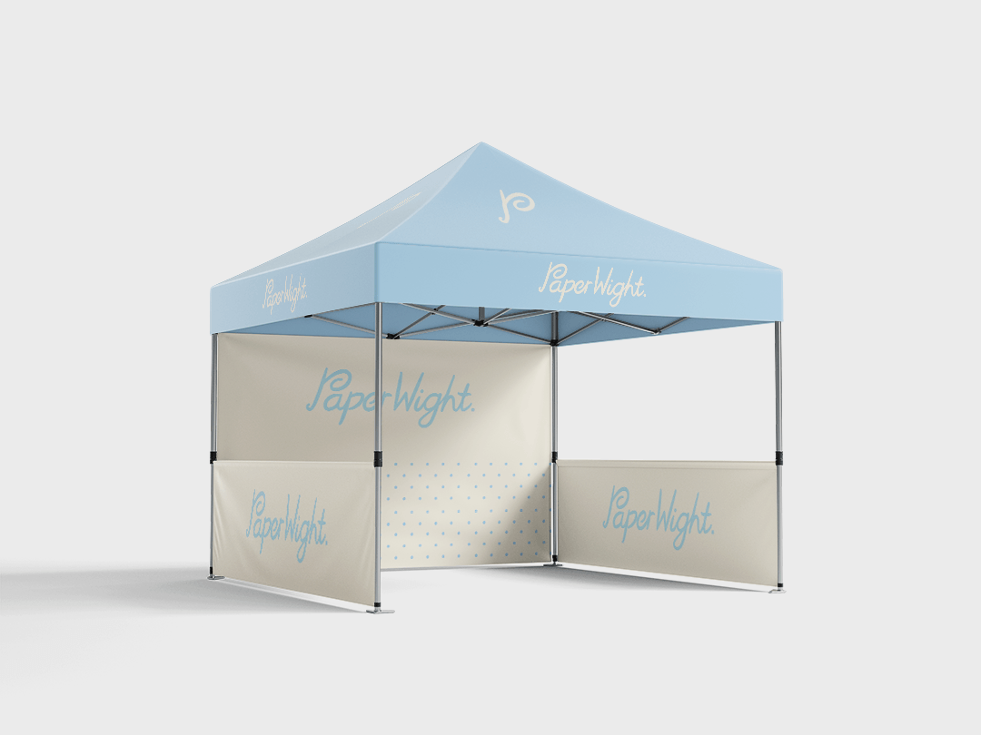
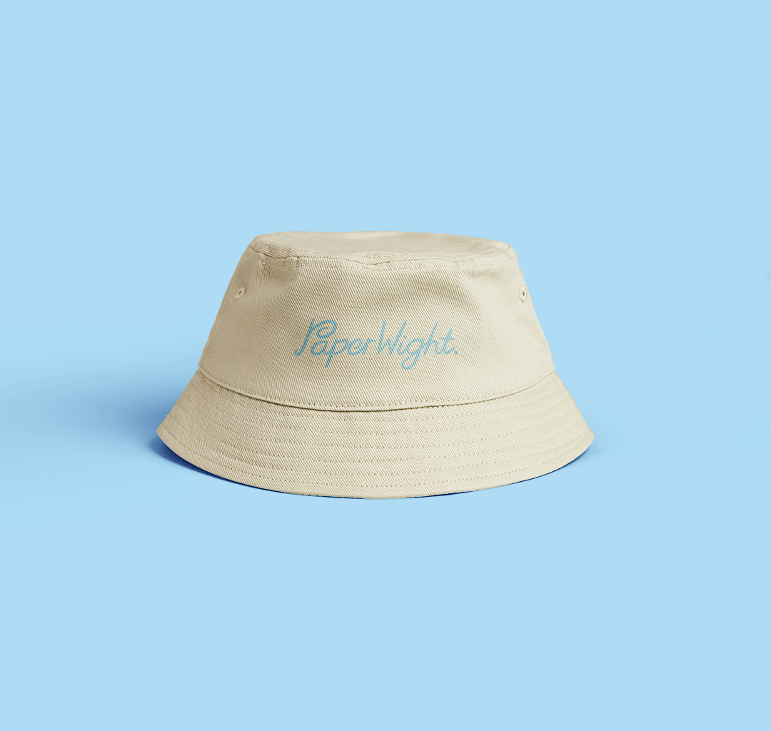
The goal was to create visual clarity that could used on packaging, event signage, handouts and social media.
A quick catchup meeting
Prior to our catchup meeting, I’d been told a bit about the project and ideas for it. This helped with creative thinking before we could have a proper chat about it.
She mentioned about her vision along with her chosen name ‘Paper Wight’. It was a play on words to sound like ‘paperweight’, while using elements of the Isle of Wight and the paper quilling process involved. She also had an idea to use the shape of the Isle of Wight as the logo as well.
During our chat, I was able to steer her away from the logo design, but she had her heart set on the name so there was no budging there. The reason for me doing this? Well, on our island there’s so many Isle of Wight shaped logos and so many companies using the name ‘Wight’ or other variations. My approach is to be creative right from the start. Nothing too obvious if you want to be remembered.
If you’re starting your own brand and want some understanding on identifying its personality from the start, download my free workbook here.
So my suggestion on the logo itself, was to play into the curls and spiral effects that paper quilling gives. With social media in mind, my focus was on creating something iconic that could be used for the avatar. That could’ve been a separate logo mark detachable from the text, but in this case I went for the approach of using the first letter and making it unique.
With that in mind, I sketched the idea onto one of the pub’s activity sheets for kids with a wax crayon, and once I explained it, it got the approval.
The designing process
Usually after a discovery meeting I’d put together three mood board directions for the client to choose from. In this case, I wanted to keep hours firm on a gift, plus I actually felt pretty confident on the direction I had in mind for this direction.
That all being said, I wanted to make sure that I wasn’t going into this two footed, so I researched some competitors. Big greeting card chains along with local suppliers. The majority used wordmark style logos, with a handful leaning into a more scripted font, so this worked well for my concept.
I took the crayon sketch to the next level. First it was more sketches to finalise overall style, and then it was created the vector graphic in Adobe Illustrator.
Once the logo was done, it was to explore colours. My mum explained how she liked blue and yellow to represent the sand and sea of the island. I felt that a more pastel direction on these colours might be more beneficial to her audience and to her own personality and nature of the business.
Once a few other bits were ironed out it was time to put it all together into a presentation.
The presentation
I caught up with my mum again to present her with the 24 page document…which to be fair, was probably overkill in page count.
It went through her purpose, mission, vision and values as well as competitors. This information wasn’t provided, but knowing my mum and digging around online, I was able to present these.
Then it came to the logo reveal, and in response I got the phrase ‘is that it?’
Luckily, I had a few more pages to go through which showed the logo in use, how it would sit alongside competitors as well as the rationale behind it. Then it all made sense to her. ‘A logo doesn’t sell what I do. It’s a symbol for others to recognise’.
So many people go wrong with logos either by including everything they do within it and making it look overcomplicated, or they go for too obvious so that they’re not remembered.
The sign-off
After presenting this document, I told my mum to sit on it for a week or two, print it out and stick it all around the house. She came back with an instant approval, no amends, only two days later *slaps palm into face*. The reason behind leaving it for awhile before fully committing, is so that you can get used to it. You have to live with this logo for a bloody long time so if you hate it by next week, then it’s going to be difficult to rebrand so soon after launching.
Once the sign-off came through and I’d given it a bit of time, the logos were exported in all their formats (read here to learn more on logo suites). I also exported the pattern designs from the logo presentation.
In addition, I made sure that she had a copy of the presentation itself. This had things like colour codes on it and gave her that extra bit of visual direction that she could look back on.
Adam recently designed and created a logo for my new small business which really suits the brief to a tee! He’s also designed some clever variations of branding and a really good video that I could post on my social media to make my brand more appealing. Because of this, I’ve just received my first bulk order! Would 100% recommend Adam for all your graphic design needs.
Sue Thacker, Paper Wight


Logo design and visual direction for craft company
Logo, business cards and everything needed down the line
The outline of this branding project
Being the loving son that I am, this little brand design project was a gift to my mum to help give the direction she needed for her brand new side hustle business of making and selling hand crafted cards, made from a technique called ‘paper quilling’.
The goal was to create visual clarity that could used on packaging, event signage, handouts and social media.
A quick catchup meeting
Prior to our catchup meeting, I’d been told a bit about the project and ideas for it. This helped with creative thinking before we could have a proper chat about it.
She mentioned about her vision along with her chosen name ‘Paper Wight’. It was a play on words to sound like ‘paperweight’, while using elements of the Isle of Wight and the paper quilling process involved. She also had an idea to use the shape of the Isle of Wight as the logo as well.
During our chat, I was able to steer her away from the logo design, but she had her heart set on the name so there was no budging there. The reason for me doing this? Well, on our island there’s so many Isle of Wight shaped logos and so many companies using the name ‘Wight’ or other variations. My approach is to be creative right from the start. Nothing too obvious if you want to be remembered.
If you’re starting your own brand and want some understanding on identifying its personality from the start, download my free workbook here.
So my suggestion on the logo itself, was to play into the curls and spiral effects that paper quilling gives. With social media in mind, my focus was on creating something iconic that could be used for the avatar. That could’ve been a separate logo mark detachable from the text, but in this case I went for the approach of using the first letter and making it unique.
With that in mind, I sketched the idea onto one of the pub’s activity sheets for kids with a wax crayon, and once I explained it, it got the approval.
The designing process
Usually after a discovery meeting I’d put together three mood board directions for the client to choose from. In this case, I wanted to keep hours firm on a gift, plus I actually felt pretty confident on the direction I had in mind for this direction.
That all being said, I wanted to make sure that I wasn’t going into this two footed, so I researched some competitors. Big greeting card chains along with local suppliers. The majority used wordmark style logos, with a handful leaning into a more scripted font, so this worked well for my concept.
I took the crayon sketch to the next level. First it was more sketches to finalise overall style, and then it was created the vector graphic in Adobe Illustrator.
Once the logo was done, it was to explore colours. My mum explained how she liked blue and yellow to represent the sand and sea of the island. I felt that a more pastel direction on these colours might be more beneficial to her audience and to her own personality and nature of the business.
Once a few other bits were ironed out it was time to put it all together into a presentation.
The presentation
I caught up with my mum again to present her with the 24 page document…which to be fair, was probably overkill in page count.
It went through her purpose, mission, vision and values as well as competitors. This information wasn’t provided, but knowing my mum and digging around online, I was able to present these.
Then it came to the logo reveal, and in response I got the phrase ‘is that it?’
Luckily, I had a few more pages to go through which showed the logo in use, how it would sit alongside competitors as well as the rationale behind it. Then it all made sense to her. ‘A logo doesn’t sell what I do. It’s a symbol for others to recognise’.
So many people go wrong with logos either by including everything they do within it and making it look overcomplicated, or they go for too obvious so that they’re not remembered.
The sign-off
After presenting this document, I told my mum to sit on it for a week or two, print it out and stick it all around the house. She came back with an instant approval, no amends, only two days later *slaps palm into face*. The reason behind leaving it for awhile before fully committing, is so that you can get used to it. You have to live with this logo for a bloody long time so if you hate it by next week, then it’s going to be difficult to rebrand so soon after launching.
Once the sign-off came through and I’d given it a bit of time, the logos were exported in all their formats (read here to learn more on logo suites). I also exported the pattern designs from the logo presentation.
In addition, I made sure that she had a copy of the presentation itself. This had things like colour codes on it and gave her that extra bit of visual direction that she could look back on.
Adam recently designed and created a logo for my new small business which really suits the brief to a tee! He’s also designed some clever variations of branding and a really good video that I could post on my social media to make my brand more appealing. Because of this, I’ve just received my first bulk order! Would 100% recommend Adam for all your graphic design needs.
Sue Thacker, Paper Wight