
Creative approach to magician’s brand identity
A simple but clever logo design along with stand out stationery
Some background into this brand project
Luke Lamont is a well known Isle of Wight magician with a professional and entertaining style.
After previously creating him a logo design for The Wonder Lounge, he came back to me to help him out by creating a visual identity for his own personal brand.
Having got to know Luke over the years and see how he performs on stage, I already had an idea of the vibe he wanted to go for. Classy, professional, and clean.
The approach
We had a little chit-chat to discuss ideas, but Luke was pretty much cool with me taking the reins on the design as the trust was there from the well received previous work.
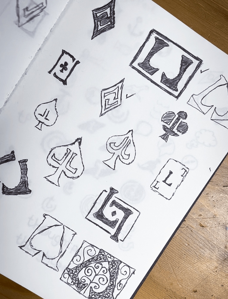
With direction ironed out early on, I opened my trusty sketch pad and started sketching ideas. Once I had a few down, more and more snowballed until I came to an idea that I felt would be totally ace…excuse the pun.
The design used his initials, LL, but rotated to look like a playing card with a subtle ace of spades in the centre.
I showed Luke the rough sketch and he could see the vision, so signed off to go ahead with making it digital.
The computer stuff
Having the foundations for the logo quickly jotted out, this saved time in the design software as I now had a clear path ahead of me.
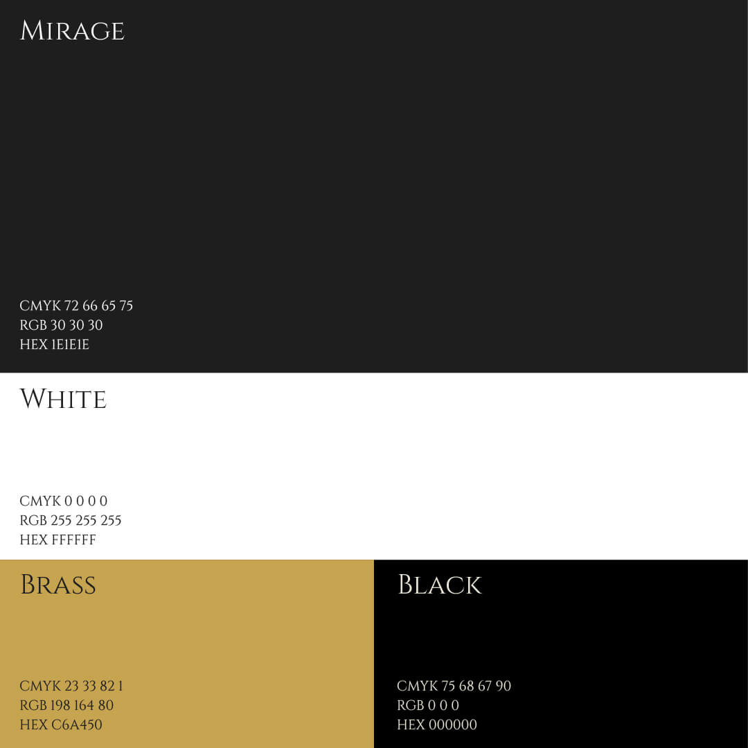
I used Adobe Illustrator to create the vector graphic in black and white and later applied colours of gold and black.
I found a complimentary font that was also quite commonly used, to make things easier if it came to creating a simple website.
The bigger picture
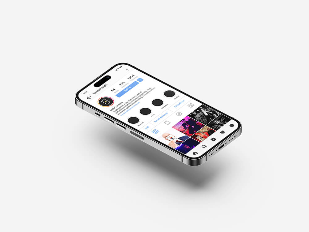
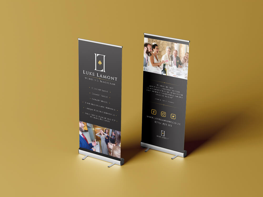
Once Luke signed off the digital logo, I could then start creating other assets that would be used.
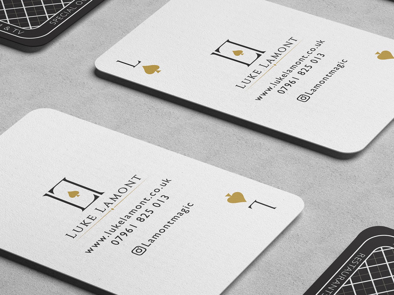
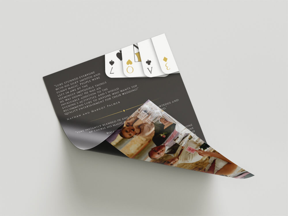
This consisted of roller banners, flyers, an animated logo, but my favourite by far are the playing card style business cards. With rounded corners and a custom pattern on the reverse that subtly includes his services, the business cards were a real conversation piece.
The long term results
This brand identity was created quite some time ago now, probably around 2017. However, it’s still going strong and whenever I speak to Luke about it all these years later, he still expresses how much he loves it.
In fact, here’s a few words from him:


I wouldn't use anyone else to handle my design needs! Great work, great guy! Check him out! The logo is timeless and can't be improved. You sir are the man, the G.O.A.T, the one and only!
Sue Thacker, Paper Wight
Creative approach to magician’s brand identity
A simple but clever logo design along with stand out stationery
Some background into this brand project
Luke Lamont is a well known Isle of Wight magician with a professional and entertaining style.
After previously creating him a logo design for The Wonder Lounge, he came back to me to help him out by creating a visual identity for his own personal brand.
Having got to know Luke over the years and see how he performs on stage, I already had an idea of the vibe he wanted to go for. Classy, professional, and clean.
The approach
We had a little chit-chat to discuss ideas, but Luke was pretty much cool with me taking the reins on the design as the trust was there from the well received previous work.
With direction ironed out early on, I opened my trusty sketch pad and started sketching ideas. Once I had a few down, more and more snowballed until I came to an idea that I felt would be totally ace…excuse the pun.
The design used his initials, LL, but rotated to look like a playing card with a subtle ace of spades in the centre.
I showed Luke the rough sketch and he could see the vision, so signed off to go ahead with making it digital.
The computer stuff
Having the foundations for the logo quickly jotted out, this saved time in the design software as I now had a clear path ahead of me.
I used Adobe Illustrator to create the vector graphic in black and white and later applied colours of gold and black.
I found a complimentary font that was also quite commonly used, to make things easier if it came to creating a simple website.
The bigger picture
Once Luke signed off the digital logo, I could then start creating other assets that would be used.
This consisted of roller banners, flyers, an animated logo, but my favourite by far are the playing card style business cards. With rounded corners and a custom pattern on the reverse that subtly includes his services, the business cards were a real conversation piece.
The long term results
This brand identity was created quite some time ago now, probably around 2017. However, it’s still going strong and whenever I speak to Luke about it all these years later, he still expresses how much he loves it.
In fact, here’s a few words from him:
I wouldn't use anyone else to handle my design needs! Great work, great guy! Check him out! The logo is timeless and can't be improved. You sir are the man, the G.O.A.T, the one and only!
Sue Thacker, Paper Wight


Creative approach to magician’s brand identity
A simple but clever logo design along with stand out stationery
Some background into this brand project
Luke Lamont is a well known Isle of Wight magician with a professional and entertaining style.
After previously creating him a logo design for The Wonder Lounge, he came back to me to help him out by creating a visual identity for his own personal brand.
Having got to know Luke over the years and see how he performs on stage, I already had an idea of the vibe he wanted to go for. Classy, professional, and clean.
The approach
We had a little chit-chat to discuss ideas, but Luke was pretty much cool with me taking the reins on the design as the trust was there from the well received previous work.
With direction ironed out early on, I opened my trusty sketch pad and started sketching ideas. Once I had a few down, more and more snowballed until I came to an idea that I felt would be totally ace…excuse the pun.
The design used his initials, LL, but rotated to look like a playing card with a subtle ace of spades in the centre.
I showed Luke the rough sketch and he could see the vision, so signed off to go ahead with making it digital.
The computer stuff
Having the foundations for the logo quickly jotted out, this saved time in the design software as I now had a clear path ahead of me.
I used Adobe Illustrator to create the vector graphic in black and white and later applied colours of gold and black.
I found a complimentary font that was also quite commonly used, to make things easier if it came to creating a simple website.
The bigger picture
Once Luke signed off the digital logo, I could then start creating other assets that would be used.
This consisted of roller banners, flyers, an animated logo, but my favourite by far are the playing card style business cards. With rounded corners and a custom pattern on the reverse that subtly includes his services, the business cards were a real conversation piece.
The long term results
This brand identity was created quite some time ago now, probably around 2017. However, it’s still going strong and whenever I speak to Luke about it all these years later, he still expresses how much he loves it.
In fact, here’s a few words from him:
I wouldn't use anyone else to handle my design needs! Great work, great guy! Check him out! The logo is timeless and can't be improved. You sir are the man, the G.O.A.T, the one and only!
Luke Lamont, Luke Lamont Magic and Shuffles Events, Isle of Wight